Newscoop 4.3 Cookbook
Best practices for designing your content
Publications can have multiple types of content: editorial copy, interviews, graphics, photos, audio and video recordings, and other digital assets. When designing pages for these types of content, you should keep focussed on the vision and style you want to convey. The importance of good design cannot be valued highly enough, because it creates the readers' emotional response to your publication. This has been proven on numerous occasions where the redesign process dramatically changed a site's traffic, even though the content remained the same.
It will be helpful to keep the potential of the Newscoop template engine in mind when creating your site's design. As a designer, this allows you to not think in boxes, but to think outside the box.
In this chapter, we want to lay down some general guidelines helping you to deliver the best structure possible for your design. This can be seen as a number of steps that a template designer should follow, like defining the grid of the template, and designing sections and pages based on that grid.
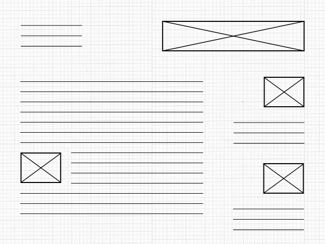
The diagram above shows you how to structure the design and also provide a good experience for your readers. Please notice the white space between sections; it can provide room to breathe, and also make clear distinctions between sections.
The template grid and the golden ratio
Typical desktop and laptop computer displays have a resolution of at least 1024x768 pixels. 960 pixels is very close to the minimum limit of monitor resolution and is also divisible by 2, 3, 4, 5, 6, 8, 10, 12, 15, 16, 20, 24, 30, 32, 40, 48, 60, 64, 80, 96, 120, 160, 192, 240, 320 and 480. This makes it a highly flexible base number to work with.
With Newscoop and with most news sites we recommend using a template that is 960 pixels wide. Fluid templates can provide more flexibility, but they defy the purpose of having a grid. A 960-pixel-wide grid (http://960.gs/) can help you divide your design structure into Newscoop's template elements like header, article area, sidebar and footer. This grid can also provide enough space for photographs and videos, things most media outlets use in great quantities.
An important part of defining the template grid is using the golden ratio (http://en.wikipedia.org/wiki/Golden_ratio). The value of the golden ratio is 1.618, but approximations can also be used, such as a ratio of 5:3. The golden ratio is most often found in nature. Nautilus shells are a perfect example; the spirals get smaller and smaller in the same proportion to each other.
Using the golden ratio can provide your readers with a clear perspective over your content. To give you a good example of how the golden ratio can be used for template design, you can set the content area to 600 pixels wide and the sidebar to 360 pixels wide, so that the ratio between the content area and sidebar is pretty close to 1.6 (600 divided by 360).
Aesthetics can be measured and more importantly can be constructed, even built from the ground up. Following a few guidelines can help you make sure you're on the right path to having a publication that not only is compositionally balanced, but also aesthetically pleasing, so that people can enjoy reading each article or part of the site. Designing a template grid doesn't have to be exact math, it's more of an experimentation of ratios and white space along with text and images.
Article design
When putting your design into HTML, you should follow web standards and the common uses of HTML tags. This is important to make your content machine-readable, which will enable search engines to understand your content and rank it higher.
The use of headings (H1, H2, etc.) for titles and subtitles, DT for definition terms, CITE for citations, BLOCKQUOTE for quotations can be seen as limited, but they can provide a very clear definition of the elements that should be designed and then styled in CSS. Usually H1 is kept for the site title, which is positioned in the header area. Remaining headings are used for article titles and subtitles of the other parts of a story.
A good way to design the article content would be using only the inline elements mentioned above and also paragraphs for the text, keeping block tags like DIV only for the presentation layer. You'll find more information on the use of tags and their importance in the chapter titled Search engine optimisation (SEO).
The template grid defines what goes inside an article and what goes outside of it. The same conventions established for the publication's design can also be used for article design; don't try to reinvent the wheel. The ratios, subdivisions and modularizations should be the same across the entire site.
Comments design
Comments are the conversation of the community behind your publication. When you design a comments structure you should take into account that people are not only communicating their ideas about the article, but also communicating with each other. Threaded comments reflect this dialogue very well. Adding profile pictures so that each reader has his/her own picture shown next to the comment is also a good idea.
When designing comments and comment forms, you do not have to follow and modify existing HTML structures. Because of Newscoop's advanced templating system, comment submission forms can be designed and styled completely using HTML and CSS.
There's a particular chapter in this manual titled Profile pictures: Gravatar, Facebook, Twitter where you can find more details about how users can set up profile pictures and display their pictures along with their comments.
Designing the other parts of a Newscoop site
Newscoop's header area is the part where the masthead and the main navigation take place. The masthead is your publication's logo or title. It should be the first thing your reader sees. It must be legible, tell people about your publication's intent and convey what they can expect. It's important to remember that while you may have looked at your own publication thousands of times, your readers may have not.
Archive design must have a clear structure, so the reader can quickly identify the article they are looking for. Usually it is shown in reverse chronological order, grouped by years, months or weeks. In Newscoop you can also use calendars to design your archives.
A well-designed search results page can provide readers with a pleasant experience, so they won't be afraid to look for articles published in the past. This manual also has a chapter titled Search Templates, where you can find more information on getting the most out of search results pages. Don't forget that your search results page should display not only the article's name, but also small pieces of supporting information about the articles (developers like to call this "metadata"), like the date it was published, the author's name and the topics assigned to the article.
Typography
Newscoop allows total control over font usage; you can even embed font faces using CSS3. Actually, one of the important parts of the design is not the choice of a single font, but all of the site's typography as a whole.
A principal part of typography is setting the line height. As mentioned before, line height is a good place to make use of the golden ratio. A value of 1.6 em should work just fine, but the recommended value is 1.5 em for the kinds of content mentioned in the beginning of this chapter.
An example of good typography for web design is to set the font size to 13 pixels and the line height to 21 pixels. This ratio between line height and font size is close to the golden ratio.
Using too many font faces might have major impact on the professionalism a publication conveys, whereas displaying fewer font faces might be less confusing for the reader. Consider using one font face for titles and a different one for article content.
<link href="http://fonts.googleapis.com/css?family=Droid+Sans" rel="stylesheet" type="text/css" />
The above line of code is an example of how to use Google Web Fonts for embedding new font faces in your design. There are several services that can provide this functionality; some are paid services like TypeKit, and some are available for free like Google Web Fonts. These services take care of providing the right font format for each browser. Some browsers are using standard font formats like OTF or WOFF (Web Open Font Format), while many mobile browsers use technologies like SVG for displaying font faces. Another very good resource for free and open source fonts is FontSquirrel.com